How to configure Helix Ultimate framework the modern, lightweight, and responsive web development framework for building websites based in Joomla. It is built on the latest web technologies such as HTML5, CSS3, and JavaScript, and features a flexible and intuitive drag-and-drop layout builder. With a focus on performance and accessibility, Helix Ultimate 2 offers a powerful set of tools and features for creating stunning, mobile-friendly websites that load quickly and are easy to maintain.
Installation
If you install a template developed with Helix Ultimate you do not need to install the plugin separately because it is already included in a package that also installs the template.
Update
The update of Helix Ultimate is through the Joomla update manager. Before updating, remember to check if your template is compatible with the version you want to install.
Configuration
To get started and better understand, open helix from: System >> Templates >> Site Templates Styles >> TEMPLATE NAME - STYLES NAME >> Template Option button. Now let's see how to configure each part of Helix Ultimate.
Important: In Templates that have many styles you must configure all the styles you are using (or all the existing ones), because they all work independently and the changes will be seen only in the pages to which the style is assigned. It is important to select the logo, change the social links, contact information and edit the footer in all template styles that use Helix
Basic
-
Logo
From the logo settings you can select favicon and decide whether to use an image or text logo. If you choose image you can choose a normal logo, logo for Retina and mobile logo, you can also choose the height of the logo for each device by activating the device on top. Remember that if your template has several styles you must change the logos in all the styles you use.
-
Header
Predefined Header composed of the Top Bar and the Header (logo and menu), is an important feature, which allows us to select a different style with a single click. These headers load by default Helix Features (Social icons, Contact Info and menus), but also load module positions.
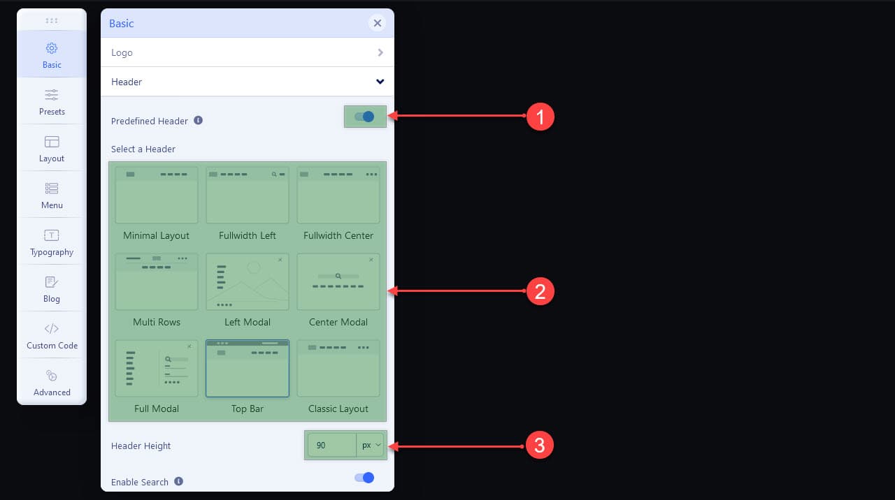
- Enable or Disable predefined Headers. Disable if you are going to create your own header version from the layout builder.
- Predefined header list. Select one. Not all templates come with the same amount of predefined headers
- Add a header height for each device (activate devices on top)
Helix Fetures
As we said in the header, the Features are loaded, especially in the topbar.
To Enable/Disable features as Search and logins (if exists) go to: Basic tab >> Header. Also you can enable or disable Social Icons, Contact Info and footer in their respective tabs inside of Basic tab.
Publishing Modules In Predefinded Headers
The positions included in these Top Bar usually are:
top1, top2, top3. And in header is included the positionmenu. Not all predefined headers include all positions -
Body
From the body tab you can activate a Preloader and select a style for it. You can also select Boxed Layout, which basically makes the maximum width of your website is the width of the container and not 100%.
-
Footer
From this tab you can edit the Copyright message. You must not delete or modify {year}, this is to automatically generate the year.
-
Social Icons
Enable/Disable, select the module position in which to show the Social Icons feature and add the urls of your social networks. You can add another social network that is not on the list in the Custom field, for this you just have to add the class then the urls like this:
fab fa-facebook https://www.yournewtwok.com -
Contact Info
Enable/Disable, select the module position in which to display Contact Info as Phone, Mobile, Email and Opening Hours.
-
Coming Soon
Activate/Deactivate Coming Soon page, adding a title, message, date, logo, background image, show or hide Social Icons. The settings you make for Coming Soon in your Default Template style will also show up when you enable Site Offline in the Joomla Global Configuration.
-
Error Page
In this tab you can select a logo and a background image that will be displayed when the server responds with errors like 404 and others
Presets - Change Colors
From here you can select a preset color, edit the preset colors or create your own Custom Style. Each preset including Custom Style have different CSS file (default.css, preset1.css, preset2.css, ...) So in each Template Style you can select different preset BUT YOU CAN'T MAKE Preset 1 or Custom Style is Red in one template style and Blue in another.
To see the changes when editing a Preset or Custom Style, you need to activate the SCSS to CSS compiler, for this go to the Advanced tab >> SCSS >> activate Compile SCSS to CSS. Don't forget to turn off when you're done!
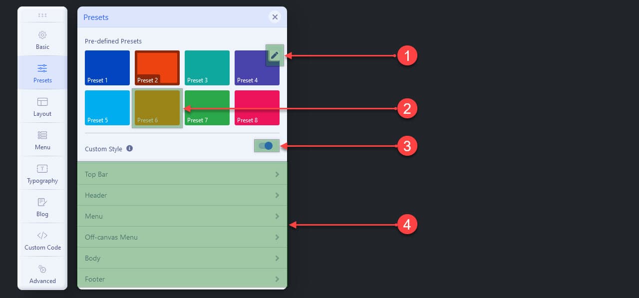
- Click to edit the preset. Click Apply to save the changes and generate a new css file with these colors, and click Reset to Default to recover the original colors of the preset. This affects all template styles where edited preset is selected.
- Select a preset color. The selected color only affects the template style you are setting, not all.
- Enable/Disable Custom Style
- Change the colors for each part of your web. This affects all template styles where Custom Style is enabled
Layout
In all templates that use Helix Ultimate Framework, the Layout is editable from the administration, you can add or remove module positions as you like. You can also change the width of the columns for all devices or a different width for each device.
How to manage Helix Ultimate Layout Builder
Not all templates developed with Helix Ultimate have the same sections, the same columns and do not have the same module positions selected. But the configuration is the same, that's why we will show you what each option of the Helix Ultimate Layout builder is for.
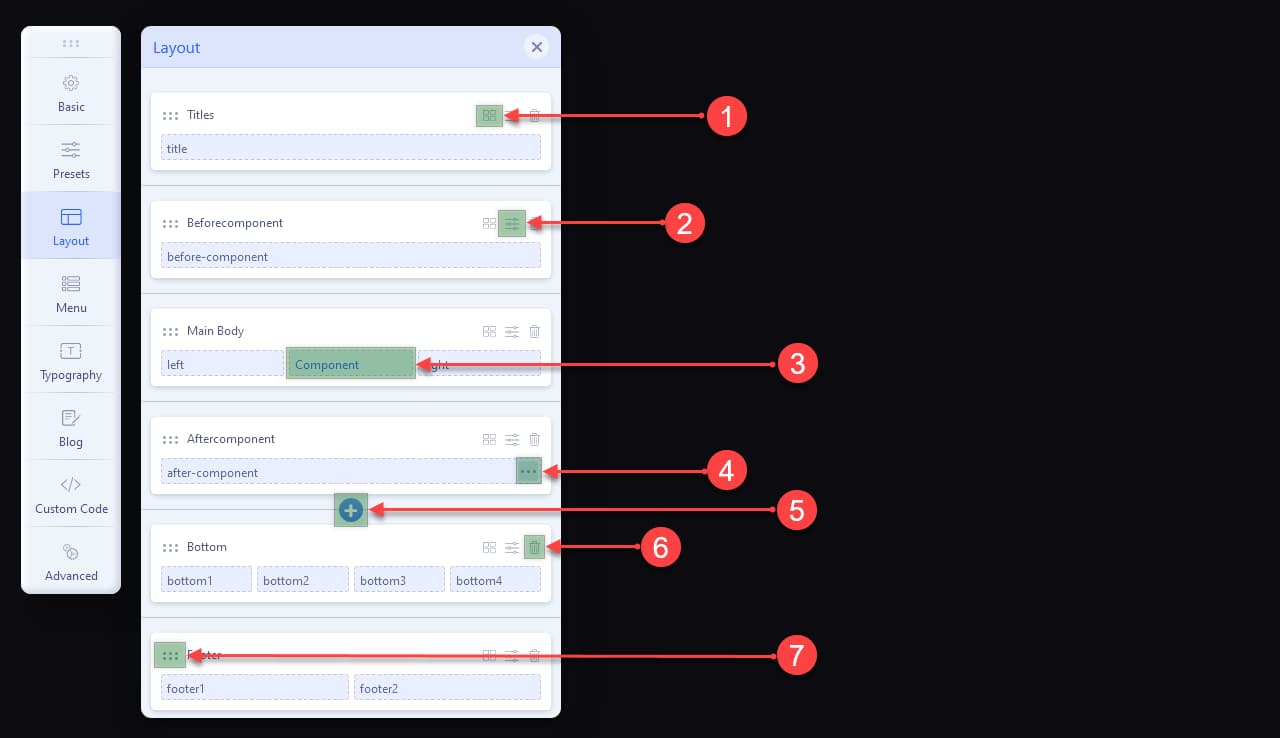
- Manage Columns. Columns number and column width.
- Row Options. Width, class, padding, margin, text color, link color, backgrounds.
- Component. You can load component area or not. you can convert any position on component from dots icons.
- Column Options. Change module position, add class, grid for desktop, tablet and phone, enable or disable Sitcky Sidebar (make in left or right columns)
- Add Row.
- Delete Row.
- From this icon you can drag and drop the row to reorder.
Important: You are free to add new sections with new IDs and add new columns with module position in any row. The sections already created can be reordered; titles should not be changed because these titles are the ID of the section.
Before changing any layout please export the configuration from the Advanced tab >> Import and Export tab, you may need to import it in the future.
Menu
From this section you can select and manage the desktop and mobile menus of your website.
-
Menu Builder
In this tab you must select the menu that you are going to use in the template style that you are configuring. If your template has several styles in each style you can select the same or another menu according to your needs.
Building your menu
After selecting your menu, Helix will load all the elements which you can edit, sort (drag and drop), even create new elements. These changes are made to the menu and its elements, so it will look same in all template styles in which you select the same menu, without the need to re-edit in each template style.
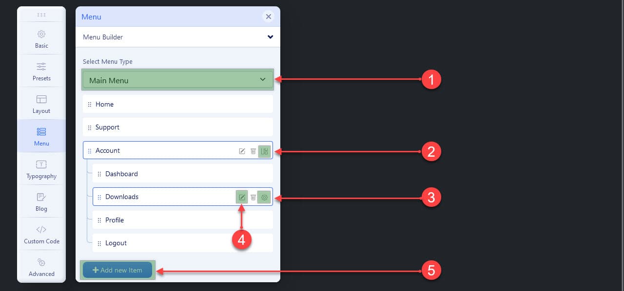
- Select the menu you want to use or build.
- Megamenu: this option is present on top level menu items and allows you to create megamenus, or simply select the dropdown position, add icon, badge or class.
- Settings: Here you can select the dropdown position (left or right) for child menu items, select an icon, add a badge or add a class to customize.
- Edit: Opens a modal with the options to edit the menu item as if you were in the Joomla menu manager.
- Add Item: Yes, from here you can create menu items of any type just like from the Joomla menu manager.
Creating Mega Menu
To see this screen you must click on the Megamenu option of the menu item in any create a megamenu. This option is marked as option 2 in the list above.
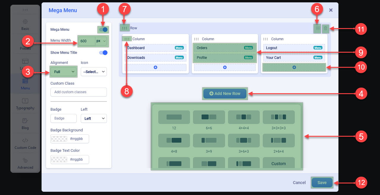
- Enbale/Disable Mega Menu for the menu elemento.
- Menu Width: It works only if in Alignment options is not selected Full
- Allows you to select the alignment of the mega menu with respect to the parent element. If Full is selected the mega menu will have the full width of the container.
- Allows to add rows for your mega menu
- Select a preset number of columns or press custom to add the number of columns with their respective widths, the sum of columns must not exceed 12.
- Edit the number of columns of an already created row.
- Click to reorder rows by drag and drop.
- Click to reorder columns within the same row.
- Sub Menu Items: These menu items are automatically added in order when the first row is created. If you want you can reorder by drag and drop, or you can remove it from the list (this doesn't remove the menu item it just won't show it in the list).
- Click to show modules, then click insert of the module you want to show in the mega menu.
- Remove Row: Deleting the rows, disabling Mega Menu and saving is needed when you no longer want to use mega menu for that menu item or when you want to rebuild the mega menu.
- Save your Mega Menu (this is elementary, but many forget and say that the changes disappear)
-
Mega Menu tab
From here we can choose if the type of menu that we are going to use for desktops is Mege Menu & Off-canvas, only Mega Menu or Only Off-canvas. We can also specify a width and an animation for our menu dropdowns.
-
Offcanvas
Here you will select the position, the style and the menu that you are going to use in Off-canvas, you can also select the maximum level of submenus of your menu to show (by default it is All).
As well as in the header, in the Off-canvas you can also Enable/Disable Search, Login, Social Links and Contact Info.
Typography
Here you can change the font for the Body, for the headings (h1 to h6), for the navigation (Menu) and Custom for selectors that you decide. If you are going to use different fonts, activate the ones you need, but if you are going to use a single font you can activate only Body because the headings and the menu will inherit from body.
We recommend only selecting the font you want. The other options such as weight, size (for desktop, tablet and mobile activate the viewer at the top), color, subset, line height, letter spacing, decoration and alignment, should be changed or specified only if you know what you are doing because our templates already have those specifications in the CSS files.
Custom
Activate this font only if you need that some part of your website needs a custom font. After activating and selecting the font you must add the CSS selectors to which you want to change the font, these selectors must be separated by commas (,) Example: #mi-id > section > .section-title, .my-class .myblock h3, h5, span, .customclass, #newid
Blog
Here are all the settings related to joomla blogs and articles.
-
Image Size
Here you can establish the measures and activate the images that you are going to use in the blogs or articles. This works only if you add an image to your articles using helix's Featured Image which is in the Blog Options tab of the article editor. In the Crop Qualy field you must decide the quality that the images cut from the original will have.
-
List
Settings for articles when they are listed in a category.
Blog List Image: Select an image size for blog list. Works only if Featured image of helix is available in the article.
Leading Article Image: Select an image size for leading article (if enabled). Works only if Featured image of helix is available in the article.
Hide Tags: Hide tags only form the list view of articles.
-
Details
Blog Details Image: Select an image size for blog (article) details view. Works only if Featured image of helix is available in the article.
Social Share: Enable/Disable show Social Share buttons to the blog details page. It may not be available in some templates or overrides for Joomla articles
Social Share List: Add or remove soical share button if Social Share is enabled.
Disable Modules: This option will disable all modules from the left or right sidebar from article details page.
Author Info: This option will show user bio as author information along with author Gravatar if the profile plugin is enabled. It may not be available in some templates or overrides for Joomla articles
Open Graph: This option will add open graph content to the article so that social media like Facebook & Twitter can show correct image for the article. Disable this option if you want to use 3rd party open graph extension.
Reading Time Pogress Bar: Show reading progress bar in blog details page. When is enabled you can select color, height and position
Related Articles: Show related articles in article details page based on category and tags. In Unitemplates we don't use this, instead we use mod_articles_category in the same position and it has many options to filter and many layouts to select from.
Full-width Layout: Activate this when you want an article to have the full width of the window and can be useful when you want to use some Page Builder inside the article. If it doesn't work after activating it is because the template or article verride doesn't have this feature.
-
Comments
If you want to use comments on your blog or articles, select the system you are going to use (Disqus, Intesedebate, facebook), select the categories where you want to show comments, fill in the credentials of the comment system you have chosen, and finally activate Comments Count if you want Show the number of comments in the article information section. Some Overrides or templates may not have this feature.
Custom Code
From this section you can add custom code, both javascript and CSS, you can add it directly or links to the files. To know what to add in each field, click on the information icon of the field name (i).
These CSS or JS will be present in all menu items where the template style is assigned. If your template has many styles make sure to add the custom code in all the ones you want to be present.
Advanced
This section contains more technical configurations of Heli Ultimate. Below, we describe what they are used for. NOTE: Changes work only in the template style that you are configuring
-
Compression
Here you can activate the compression and combination of CSS and JS files. In theory this is a function that could help improve the performance of your website, but in practice perhaps instead of helping it can get worse, for example compressing already compressed files or trying to combine files already combined by other extensions would be unnecessary tasks that in instead of improving it would worsen the performance of your site. We recommend disable it if you don't know what you're doing.
-
SCSS
Compile SCSS to CSS: Enable this option will compile all the
SCSSfiles during each load of your website if the SCSS file has been edited or you are doing changing preset colors. Turn off this option if your site is in production mode. -
Font Settings
Enable Font Aswesome: You can enable/disable the Font Awesome icons to load your site.
Google Font API: Click on the information icon (i) to visit the website where you can obtain the API KEY. Then paste your API KEY in the blank field, then press save (top right corner), when Helix Ultimate reloads you can press the UPDATE button, this will update the Google Fonts lists including the ones you are using in the Typography section.
-
Image
Lazy Loading: Enable this option will allow you to load all of your images in a lazy mode. This will defer all the offscreen images. To learn more about it, visit
https://github.com/aFarkas/lazysizes -
Export and Import
Export Settings can be used to create a backup of the template style before making major changes or deleting the template style.
Import Settings can be used to recover template style settings if disaster strikes or you want to recreate a deleted template style from the JSON file that was generated on Export.
-
Analitycs
Google Analytics 4 Tracking ID: Find your tracking code in Google Analytics and paste it into the field. Remember that if your template has many styles you must enter the code in all template styles that you use or want to track.
Module Positions
The positions of module that we list below are those that include Helix Ultimate by Default.
title, top1, top2, top3, logo, menu, menu-modal, search, slide, user1, user2, user3, user4, left, right, feature, slider, position1, position2, position3, position4, position5, position6, position7, position8, content-top, content-bottom, bottom1, bottom2, bottom3, bottom4, breadcrumb, footer1, footer2, comingsoon, offcanvas, pagebuilder, 404, debug, offcanvas-modules
In Unitemplates we add positions like: before-component to display full-width modules before the component, after-component to display full-width modules after the component, and related to display Related Posts on blogs, Related Works in portfolios or Related Products in a store. Depends on which template you are using.
To know exactly which positions are being loaded, activate the Joomla module position viewer:
Go to: System >> Templates >> Site Templates >> Options button (right corner) >> Enable Preview Module Positions >> Save and Close.
Then you can click on the link Preview of the template or add ?tp=1&template=TEMPLATE_NAME (example: ?tp=1&template=ut_reto) in front-end at the end of the url of the page that you want to see the positions.
Templates Styles
Professional templates like the ones we develop here at Unitemplates have many styles, because we create many versions of homes, pages, portfolios, blogs and other pages. In some cases it may have a different Layout, but mostly it is only created to select a different menu, header or color.
By this point you will already know that many of the settings affect only the template style being configured, therefore the changes will only be seen in the menu items to which the template style is assigned, so if you use multiple template styles, you must make changes in all.
Use only what you need
In Unitemplates our template styles have as part of the name the page, section or version for which it was created, for example if our demo has 6 versions and you want to use version 2, the templates to use are ut_NAME - Default (this does not must be deleted), ut_NAME - Version 2 Home and ut_NAME - Version 2 Pages, that is, the Default and all those with Version 2 in their names. The rest you can delete, but remember before deleting go to the Advanced >> Export and Import >> Export Settings tab to make a copy in case you need to recreate an accidentally deleted style.